Cotton Flower Clothing
Unique and natural yoga clothing
Surviving the online commerce market in a digital age
Duration: 2 + 1 Weeks (separate intervals) Tools: Adobe XD, PhotoshopPlatform:Desktop + Mobile Team: Solo
Picking the store
For this project, I wanted to focus on redesigning a small store that has a lot of potential and renewing it to give it the arsenal it needs to survive the digital age.
I'm a big fan of Etsy, I think it's a wonderful way to support small businesses that get virtually no visibiltiy due to their poor online presence. While looking for a cotton skirt, I came across this relatively small online only business with a shocking 24,000 reviews and nearly full stars. I wouldn't give their personal website that rating, but knowing that Etsy takes roughly 5% of their revenue it seemed like a good candidate for a redesign.
Store Background
While learning Thai massage in Thailand, Sarah Gingles fell in love with Thai gauze. Frustrated with tight fit and unnatural clothing currently dominating yoga in the West, she decided to design a collection of natural loose fitting yoga clothes and bring them to the West which resulted in Cotton Flower Clothing.
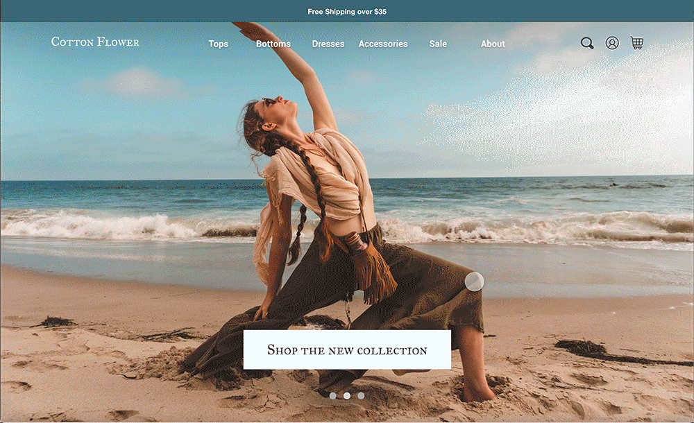
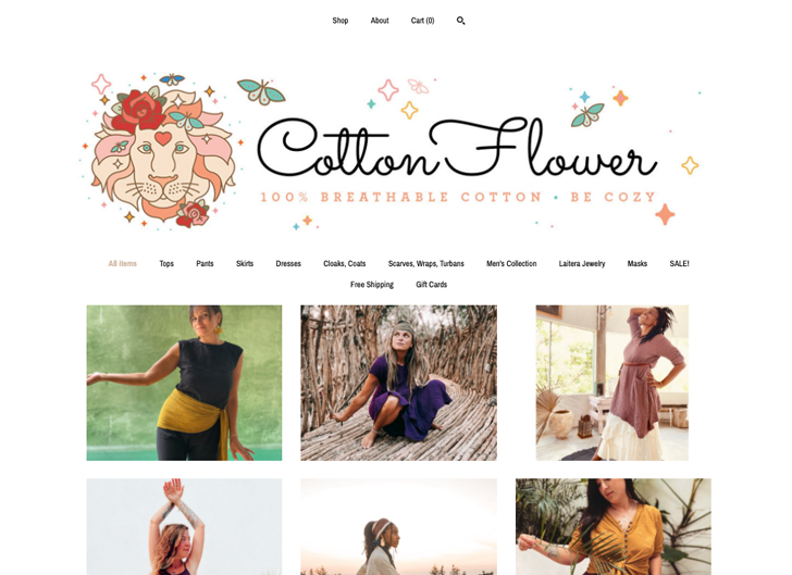
View original websiteThe Problem
Cotton Flower Clothing is an online-only business that heavily relies on Etsy. The website they run on the side, also hosted by Etsy is not unusable, but does not look professional, can be confusing, and overall is not pleasing to use.
Research
Survey
Survey results are coming soon...
User Interviews
I interviewed three different users asking them questions like:
I also asked each user to pick an item at Cotton Flower Clothing and performed a diagnostic user testing session which was vital to seeing design flaws that I had not noticed before. Here are a few interesting tidbits:
As a final step, I asked each interviewee to do a short card sort to categorize the items in the store.
User Personas
Neda
 Neda is a financial analyst living in NYC. During her downtime, she has found that meditating has helped her manage her stress. She recently started practicing yoga at a local studio but felt uncomfortable purchasing tight fit yoga clothing due to her age. “Are there other options?” She wondered. Some of her biggest paint points include being distrustful of online stores and reviews, as well as being nervous about the return process.
Michelle
 Michelle is a 2nd year college student at UF. She’s been spending a lot of time in her dorm lounge in her loungewear but the loungewear she wears at home in NY feels a little too hot for FL. She’s been frivolously searching for loose natural pants that are sustainably made. She also needs to budget her money and prefers staying away from fast fashion brands.
Planning
Affinity Mapping User Interview Results
Competitive Analysis
A strategy that I found really helpful was not reinventing the wheel by carefully observing existing UX principles by studying existing stores. One great example of simple design and a huge inspiration was Madewell. I found moodboarding and taking notes on features that might be not noticeable in the passing very helpful in coming up with my final design.
Mid-Fidelity Wires
After the research and a lot of sketching, I ended up with a Mid-Fidelity wireframe which I prototyped and tested with two unique users. I made some small changes to the layout, spacing, and breadcrumbs after each session as users generally had little trouble navigating the site.
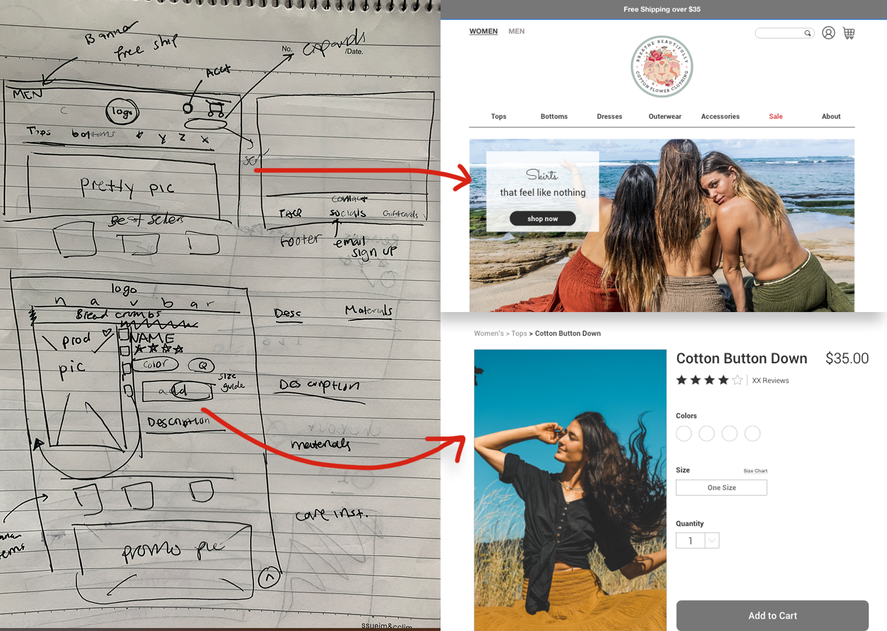
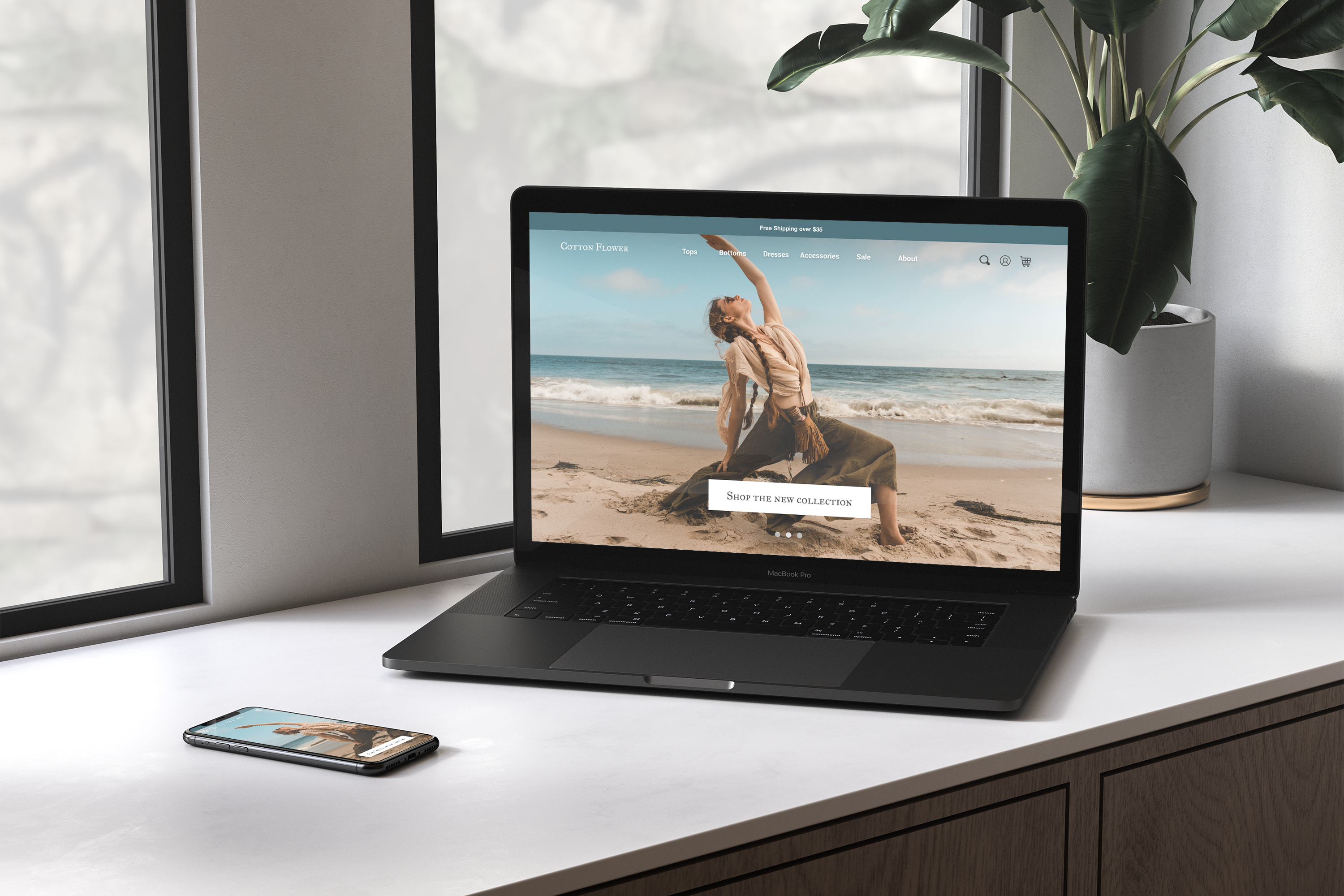
High-Fidelity Wires
The high fidelity wires happened roughly a month after the start of the initial project, with a hefty break inbetween. After revising my mid-fid wireframes I was shocked at how much my expectations of myself and my work had changed. so I got to work, and boy did I have a lot of work to do.
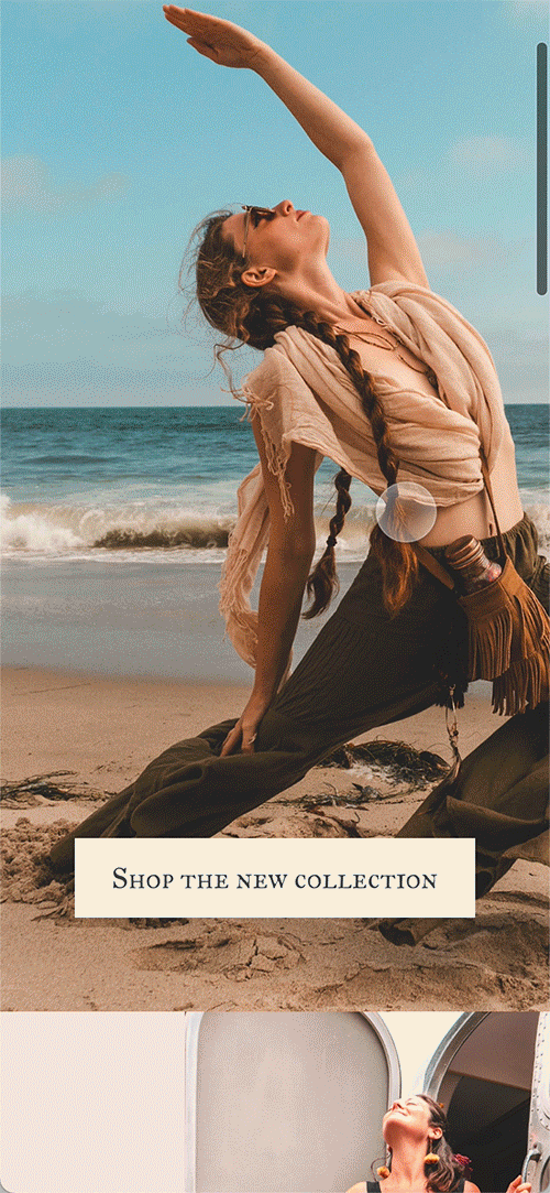
Shifting Expectations + making a responsive mobile version
Revising the prototype made me realize I needed to study. No, there was no actual book to study, but what I needed to do was to look at more stores instead of my narrow focus on Madewell. How can I make this design stand out? What makes an e-commerce site "bad" and "good"?
I found passive studying of different websites, and their mobile counterparts the most important turning point of this case study.
you can view the full high fidelity mockups through the links provided below.